
Design That Sticks: The Graphic Brilliance Behind TV and Film
The other night, I found myself doing something I suspect many of us design nerds are guilty of—I hit pause. Not because I missed a plot point, not because I was distracted, but because Severance had just thrown another ridiculously well-designed poster in my face, and I needed to soak it in. Dany Aviles' eerie, corporate propaganda-style graphics hanging on the walls of Lumon Industries weren’t just decoration—they were storytelling.
And then it hit me: this wasn’t the first time design had completely hijacked my attention. Flashback to my first year of Graphic Design at university, sitting in a dark cinema watching The Grand Budapest Hotel for the first time. The level of detail, the sheer commitment to a visual language across props, signage, and packaging—it was the moment I realized, wow, I want to be able to do all this.
Design in film and TV isn’t just about aesthetics. It’s about world-building, narrative depth, and making stories linger in people’s minds long after the credits roll. So, we’re taking a moment to celebrate the productions that get it right—where design isn’t an afterthought but an essential character in the story.
Design That Makes Stories Unforgettable
Think about the shows and movies that stick with you. There’s a good chance their design played a major role in making them memorable. A great design system is its own universe—a set of rules, symbols, and visual language that audiences instinctively learn to navigate. When done well, it doesn’t just complement the narrative; it becomes part of it.
We’ve rounded up five masterpieces that showcase just how powerful graphic design can be in storytelling. From subliminal messaging to full-on visual world-building, these picks prove that great design isn’t just seen—it’s felt.
Ozark – Minimalism Meets Menace
Designed by Neil Kellerhouse and Fred Davis
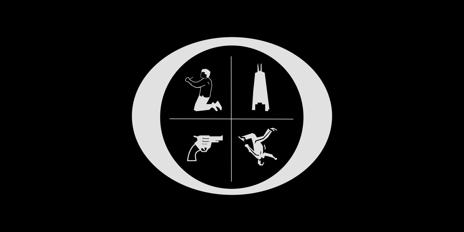
When Jason Bateman was developing Ozark, he knew he wanted to avoid the traditional credit sequence. That's when he decided to reach out to Neil Kellerhouse and Fred Davis, who delivered something far more intriguing: a title card that morphs with every episode. Four cryptic, monochromatic symbols appear within the letter “O,” subtly spelling out O-Z-A-R-K while hinting at key elements of the plot.
It’s graphic storytelling in its purest form—stripped-back, mysterious, and loaded with tension. Fans quickly caught on, turning each title screen into a mini-puzzle to decode. The result? An identity so tightly woven into the show’s DNA that you can’t separate the two. It’s not just a title sequence; it’s an experience.
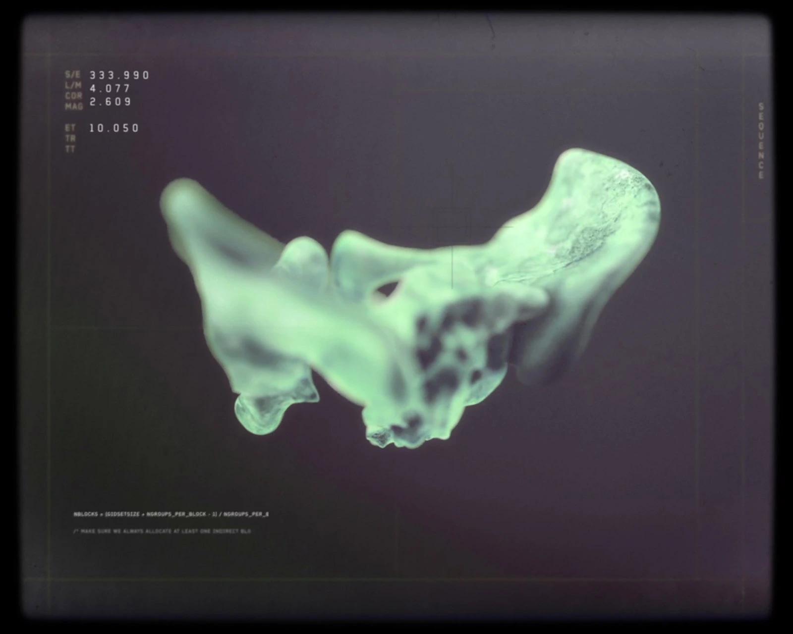
Severance – The Dystopian Corporate Identity We Can’t Get Enough Of
Branding and graphics by Adam Brustein
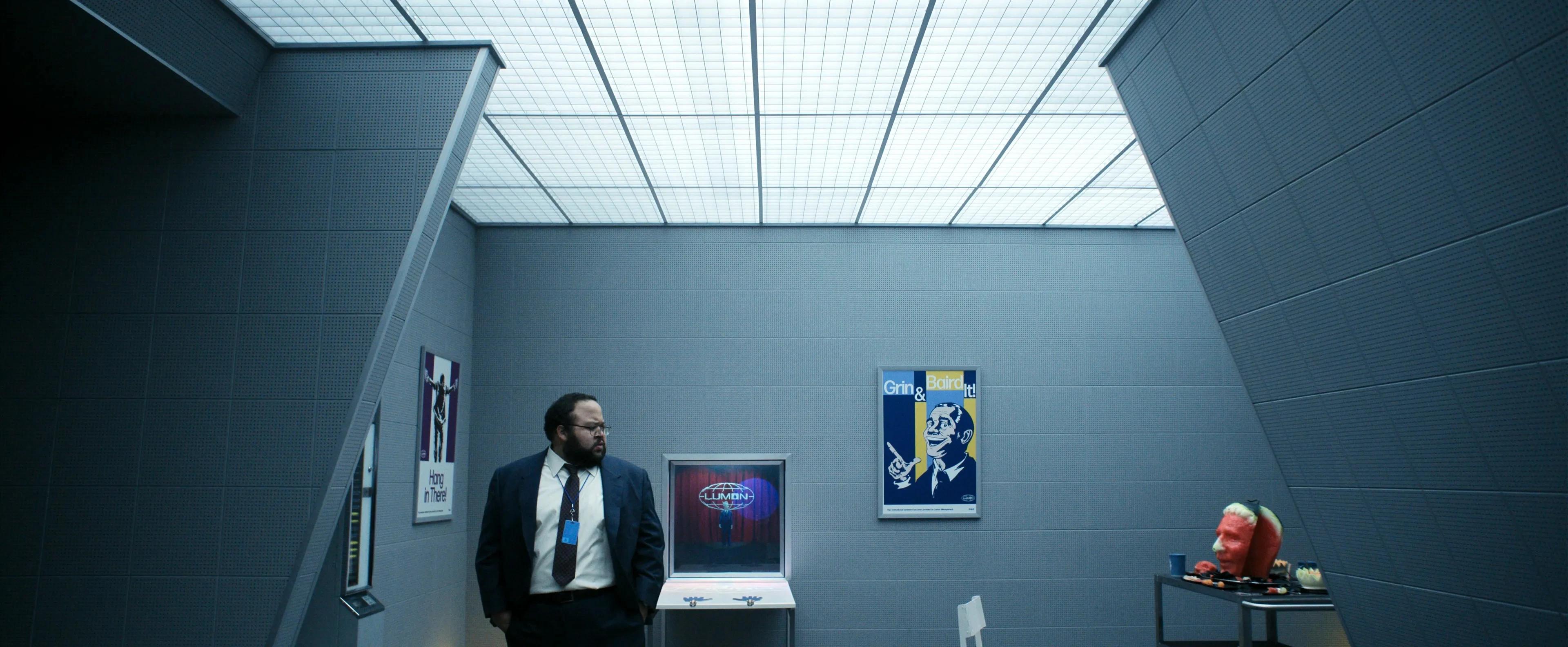
Alright, let’s talk about Severance. Because if you weren’t already obsessed with its unsettling, retro-futuristic branding, you’re about to be. The show’s entire aesthetic is one of the strongest examples of world-building in recent years—every graphic element is so well thought out, it’s borderline criminal.
From the moment you step into Lumon Industries, you’re hit with a wave of corporate ick. The kind that makes you question reality a little bit. The sterile office interiors, the outdated tech, the maze-like hallways—it all feeds into the psychological unease. And then, there are the posters. Adam Brustein’s designs look like they were ripped straight from some dystopian HR handbook, dripping with forced positivity and quiet menace. And when Season 2 dropped those new Breakroom posters by Dany Aviles? Pure world-building gold. Fans don’t just watch Severance; they dissect it. The show’s design turns every detail into a clue, making us all detectives in its unsettling universe.
Lumon Branding and the Power of Fictional PR Strategy
Now, let’s talk branding. Because Severance didn’t just give us a story—it gave us Lumon Industries, a fictional corporation so well-designed it feels disturbingly real. From the moment Apple TV+ launched the show, they leaned hard into world-building. We’re talking subway ads, cryptic PR packages, and an internal comms playbook that feels like it could genuinely be used in a soulless corporate office.
The result? A brand that exists beyond the screen. Fans aren’t just watching Severance—they’re Googling “Lumon Industries branding” and “Severance PR strategy.” They want in (hopefully not literally). For marketing nerds, this is next-level stuff. It proves that even a fake company, when designed well enough, can gain real-world influence. And that’s the power of branding done right.
The Lexington Letter: Expanding the Lumon Universe Through Innovative PR Storytelling
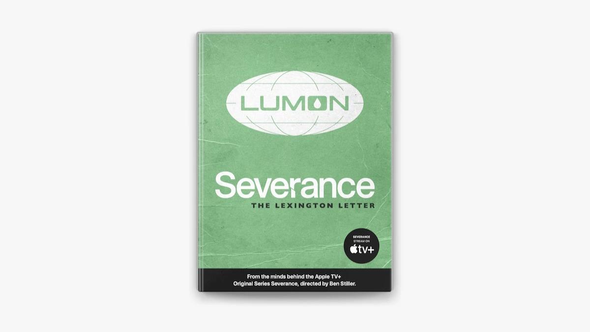
If you thought Severance’s storytelling ended with the show, think again. Enter The Lexington Letter—a series of letters supposedly written between an ex-Lumon employee’s Innie and Outie. And let me tell you, it’s as mind-bending as it sounds.
Published as part of the show’s official companion book, these letters weren’t just some marketing gimmick—they cracked the Severance universe wide open. They gave fans a deeper look into the psychological chaos of severed workers, hinting at the horrifying implications of Lumon’s procedures. And, of course, they left us with even more questions. Who really wrote them? Were the messages actually received? Did the employee ever make it out? The ambiguity fueled endless theories, making The Lexington Letter one of the smartest expansions of a TV world in recent memory.
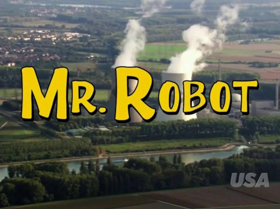
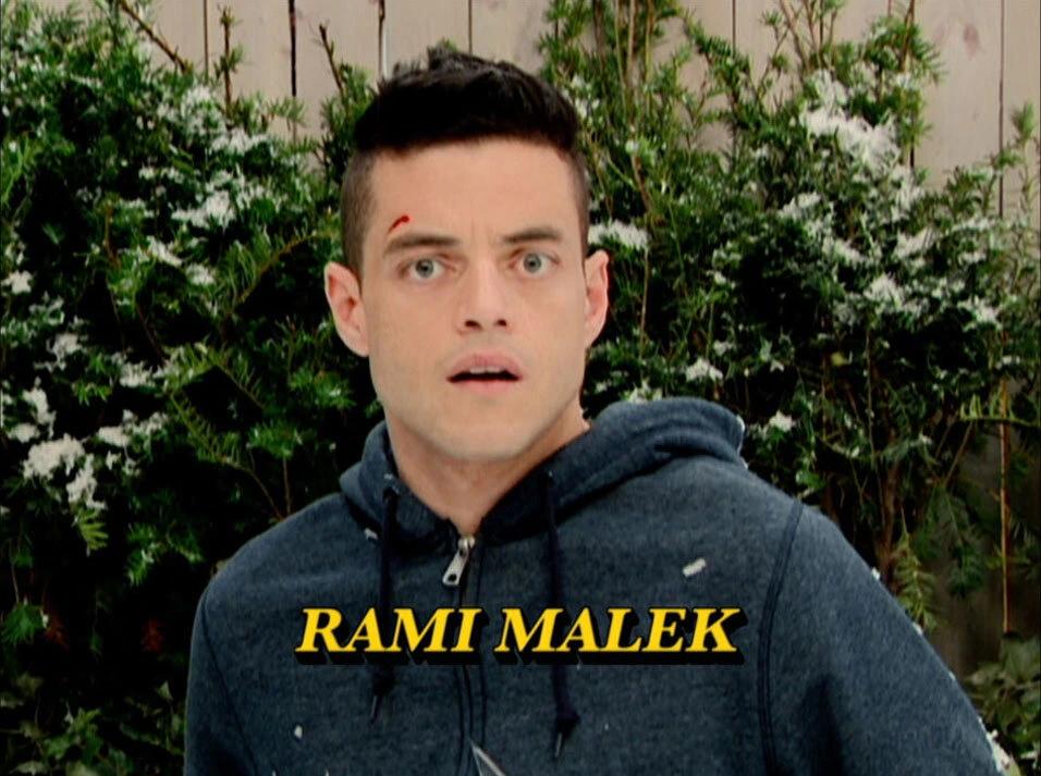
Mr. Robot – Hacking Culture, Designed to Perfection
UI and on-screen graphics by Adam Brustein (yes, again—this guy knows his stuff)
If Hollywood hacking usually makes you roll your eyes (ahem, green Matrix code and inexplicably fast typing), Mr. Robot is the antidote. Brustein’s approach to UI and on-screen graphics is the real deal—raw, messy, and entirely believable. Old-school Linux terminals, glitchy command lines, and interfaces that feel authentically used rather than designed for show.
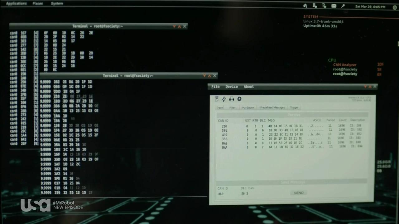
And let’s not forget the retro-infused brilliance sprinkled throughout the series—like the Commodore game (https://vimeo.com/185055730) sequences and that glorious Too Many Cooks-esque episode. The visual choices don’t just support the narrative; they deepen it, making every screen feel like part of the Mr. Robot universe.
Blade Runner 2049 – A Future Built on Screens
Screen graphics by Territory Studio
Few films understand the power of UI like Blade Runner 2049. Tasked with designing screen interfaces for the sequel to Ridley Scott’s iconic film, Territory Studio went all in, delivering over 100 assets across 15 sets. The result? A world where technology feels tactile, flawed, and strangely beautiful.
The world of Blade Runner 2049 is a masterclass in immersive design. Every interface, every screen, every flickering glitch feels like it belongs to a future that’s both advanced and completely falling apart. Instead of relying on digital wizardry alone, the design team experimented with old-school tech—cine projectors, microfiche, even magnified grapefruit flesh—to create organic, tangible visual effects. The result? A future that looks real because it’s built from the physical textures of the past.
K’s Spinner
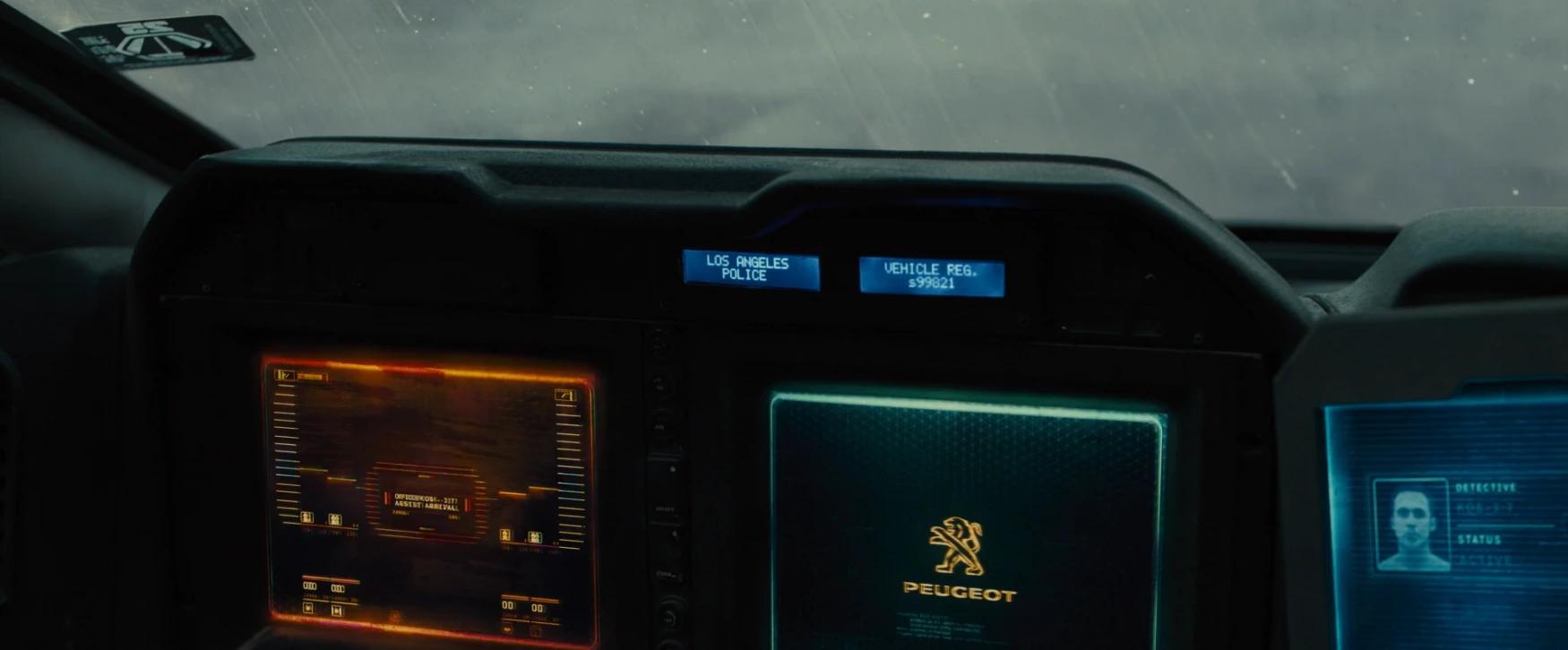
A battered, glitchy mess of a vehicle, K’s spinner is the perfect reflection of his low status. Its interfaces are warped and flickering, loaded with color degradation and surface damage, making it feel like it’s barely holding together—just like K himself.
Morgue
The morgue scene needed screens that didn’t just display data but added to the drama. Territory Studio designed animations that shift like optical lenses, each level of magnification bringing us closer to the big reveal.
Market
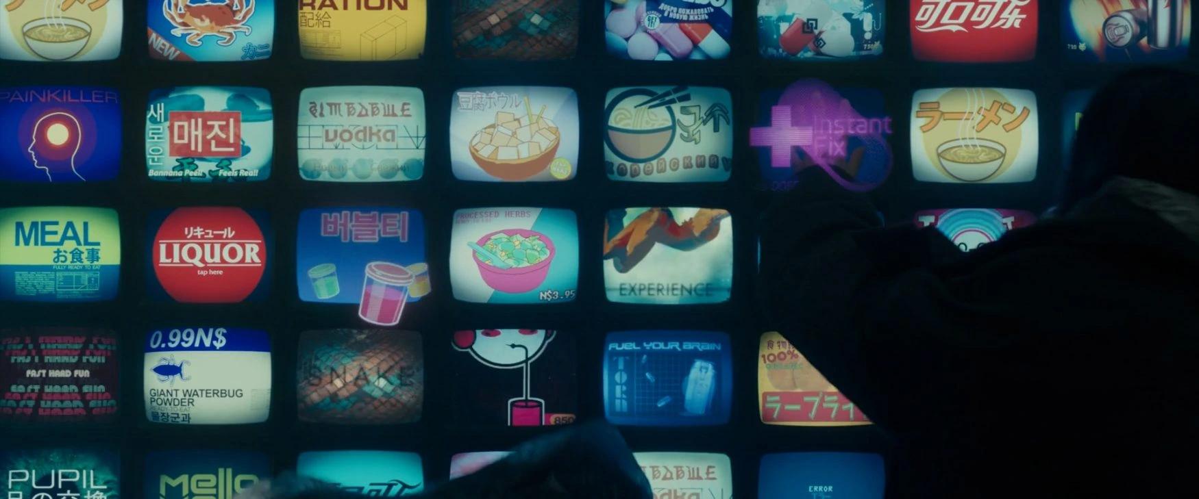
The neon-drenched markets of LA 2049 are a typographic playground. With an open brief to create signage, the team mixed Latin, Cyrillic, Arabic, and Kanji, designing an eclectic, multilingual visual landscape that feels as chaotic as it does authentic.
The Grand Budapest Hotel – A Masterclass in Film Design
Graphic design by Annie Atkins
Flashback to my first year of Graphic Design at university, sitting in a dark cinema watching The Grand Budapest Hotel for the first time. Cue heart palpitations. Every single label, document, sign, and pastry box was meticulously handcrafted by the one and only Annie Atkins—a graphic designer whose work on the film turned props into full-blown storytelling devices.
She created everything from the iconic Mendl’s pink boxes to passports, telegrams, hotel room keys, police reports, banknotes, and bakery packaging. It was an absolute feast of ephemera that didn’t just sit quietly in the background—it whispered secrets, hinted at plot points, and stitched Wes Anderson’s world together with a thread of obsessive visual consistency. That was the moment I realized, yeah, I want to make stuff like this. Design that doesn’t just look pretty—it lives in the world it helps build.
Design as Storytelling’s Secret Weapon
Great graphic design in film and TV isn’t just a bonus; it’s a storytelling powerhouse. It builds worlds, deepens narratives, and keeps audiences hooked on the details. And when it’s done well, it becomes inseparable from the story itself.
So next time you find yourself pausing a show to take in the typography, the UI, or a subliminal message hidden in the visuals—just know, you’re not alone. We see it too, and we love to geek out about it.
And hey, if you ever need someone to build your brand with the same level of immersive storytelling? You know where to find us. 😉
Jonathan blends business sense with creative instinct, using both to build brands that actually connect. With a background in marketing, design, and leadership, he’s known for spotting clarity in the chaos — then charting the course forward.
He’s most in his element collaborating with smart, curious people and shaping work that feels as good as it looks. When he’s not deep in the details, you’ll probably find him on a basketball court — with a tight handle and a smooth jumper.
Pierre leads the creative team at Juice, where big-picture business goals are transformed into bold, thoughtful design. He’s always pushing the team to explore new ideas and keep their creative edge sharp—that’s how they stay ahead of the curve. For Pierre, collaboration is the best part; watching individual talents come together to create something bigger than any one person could on their own never gets old.
His roots are in hands-on design—sketching, illustrating, getting scrappy before going digital—and that foundation still shapes how he thinks about craft and creativity today. Outside the studio, you’ll likely find Pierre in Paris with a croissant in hand, wandering through museums or planning his next adventure.
Max brings ideas to life on the web, building high-performing, responsive websites in Webflow and front-end code. He’s all about smooth, engaging user experiences—think clean animations with GSAP and intuitive interactions that just feel right. With a background in design, Max bridges the gap between visuals and development, making sure every build feels intentional and usable.
He loves that moment when a prototype turns into something real and interactive—it’s like solving a puzzle with purpose. Outside of work, Max is either biking with his family, jamming on guitar with his son, or slowing things down with a good meal and morning coffee.
As Producer at Juice, Rachael is the one making sure the train stays on the tracks—from kickoff to launch, she keeps the team aligned and the momentum strong. Constantly connecting dots between clients and creatives, she ensures every move is thoughtful and on point.
She’s inspired by people who are all-in on what they’re building—there’s nothing better than chasing a shared vision together. With a background in graphic design, she brings both a creative eye and a deep respect for collaboration to every project. Outside of work, Rachael is either out on the trails with her dog or cozied up with her cat and a good book.
Vlad is a digital designer (and proud coffee addict) focused on crafting websites that are not just beautiful, but intuitive and genuinely enjoyable to use. He lives for turning messy ideas into clean, user-friendly experiences—and yeah, hearing “That’s exactly what I imagined” is unbeatable.
Having grown up loving both art and tech, web design became a natural fit for Vlad, blending creativity with structure in a way that still drives how he works today. Off the clock, he’s usually chasing his daughter around the playground, building LEGO forts, or soaking up the chaos with his family—snacks and laughter included.
In her role as a producer, Maida is all about connecting the dots—translating client visions into actionable steps and ensuring the team stays aligned every step of the way. She works at the intersection of creativity and logistics, making sure ideas move seamlessly from concept to execution.
With a background in marketing and communication, Maida knows how to manage the pressure without losing sight of what matters most—people and relationships. Off the clock, she’s either playing pickleball or relaxing with her cat, Pepper, who definitely runs the show at home.
Dasha is a web developer who loves turning big ideas into clean, scalable websites that actually make sense. With a focus on logic, accessibility, and smooth user experiences, she makes sure everything works just as well as it looks. There’s a real satisfaction she finds in taking messy, complex problems and organizing them into components that clients can easily use and build on.
She especially enjoys the work that isn’t straightforward—the kind that requires digging in, exploring, and finding clarity in the chaos. Outside of code, she's probably at karate, walking with her family, or deep in a good conversation (or thought spiral) about human psychology.
Pablo specializes in creating graphic pieces—often animated—that bring client ideas to life. He thrives in both the ideation and production stages, finding satisfaction in turning fresh concepts into polished work.
His background in university laid the foundation for his career, but real-world projects and clients shaped his creative approach. Restless, curious, and driven, Pablo is a passionate professional who never gives up. Outside of work, he enjoys drawing, racing with his girlfriend, sharing meals with friends, and watching great movies.
At Juice, Miranda is a designer focused on creating work that’s as thoughtful as it is visually sharp. With a background in print, she brings a strong sense of structure and storytelling to every digital project. She’s all about crafting experiences that feel intuitive, purposeful, and just the right amount of bold.
Whether she’s sketching on paper or refining pixels, Miranda is always chasing that perfect balance of form and function—powered by mate and closely supervised by two very opinionated cats.
CEO